
2013 has been an interesting year with awesome releases, and one of them is the coolest thing this year has release is Flat Designs, Minimalist Design and Responsive Design for web and iOS developers.
The simplicity of those new ways to improve web and mobile web platform has taken over the net, not only by their good looking but also with the speed that developing on based on this designs provide. If you are an entrepreneur you might be concern in 2 things that are very important for your business: The “Simple is Better” concept; and the rapid increase for portable devices, so do you want to get more familiar with webs?
This year trend focus points are:
- Better UX
- Mobile Friendly
- Simplicity
- Contents is First
- Great Effects
- Cools Images
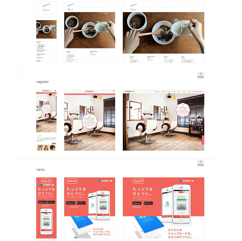
Responsive Design
A responsive website changes its appearance and layout based on the size of the screen the website is displayed on. Responsive sites can be designed to make the text on the page larger and easier to read on smaller screens also can be configured to make the buttons on the phone’s screen easier to press.
Responsive design focuses on:
- No need for mobile specific version
- Better UX with any kind of device
- One design for any size
- Fix performance issues
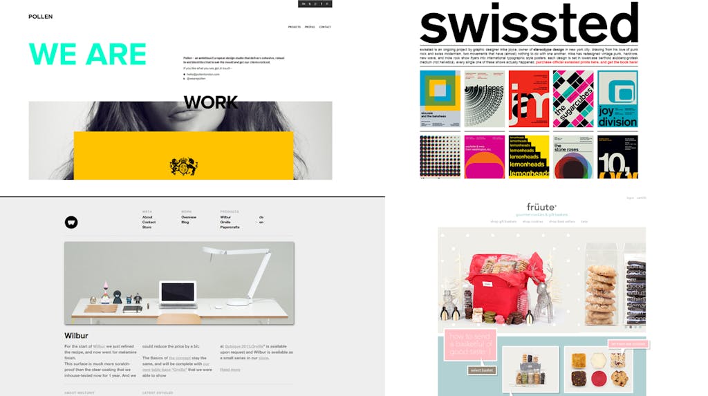
Flat Design
Flat design is a minimalistic design approach that emphasizes usability. It features clean, open space, crisp edges, bright colors and two-dimensional/flat illustrations.
Flat design focuses on:
- Color scheme and typography
- Less gradient, box shadow
- Easy backward compability
Minimal Design
Minimalism is achieved by reducing a design to only the most essential elements. Expressions of minimalism span multiple disciplines, as well as other art forms such as music and literature. For website designers, though, minimalism can be intimidating and difficult to master.
Minimal design focuses on:
- Keep things simple focus on the core
- Good typography + illustrations
2013 Designing Points
Most of websites has changed their look on this year by improving a lot on their visual and function parts to promote their products or services. The old way to think about website I guess has changed totally that most of the users make a website for introduce their services or products, on 2013 users notice that do that is not enough that’s why they start to focus not only on the design but also on how to lead their personas to become client catching them by marketing strategies and development design.
Here is some important changes that 2013 web trend has bring to Internet:
- Main Image: Using large Photo backgrounds to catch the attention of the user on the first view.
- Easy Navigation: That focus on provide a better UX on web navigation menus.
- Be Responsive: Develop websites that can fit in any kind of device.
- The amazing infinite scrolling that allows you to have a faster browsing with a friendly touch.
- Sliding Panels: With slides your website will have a better way to introduce pages making them more dynamic, or using multiple static pages manage from sliding panels giving some awesome effects to improve the user navigation.
So what kind of website do you have? Are you improving it?


