
If you an Inbound Marketer but also a developer who wants to improve your creative ideas and marketing strategies here is some responsive framework resources that might be interested! Dont forget that be a inbounder is not only focus on the contents you will deliver is also focus on which kind of persona and from where you want to be found!
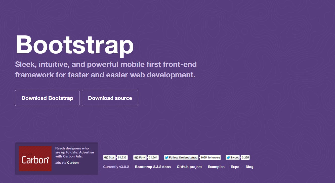
1.BootStrap
Bootstrap is an open-source Javascript framework developed by the team at Twitter. It is a combination of HTML, CSS, and Javascript code designed to help build user interface components. Bootstrap was also programmed to support both HTML5 and CSS3.
Bootstrap was created at Twitter in mid-2010 by @mdo and @fat. Prior to being an open-sourced framework, Bootstrap was known as Twitter Blueprint. A few months into development, Twitter held its first Hack Week and the project exploded as developers of all skill levels jumped in without any external guidance. It served as the style guide for internal tools development at the company for over a year before its public release, and continues to do so today.
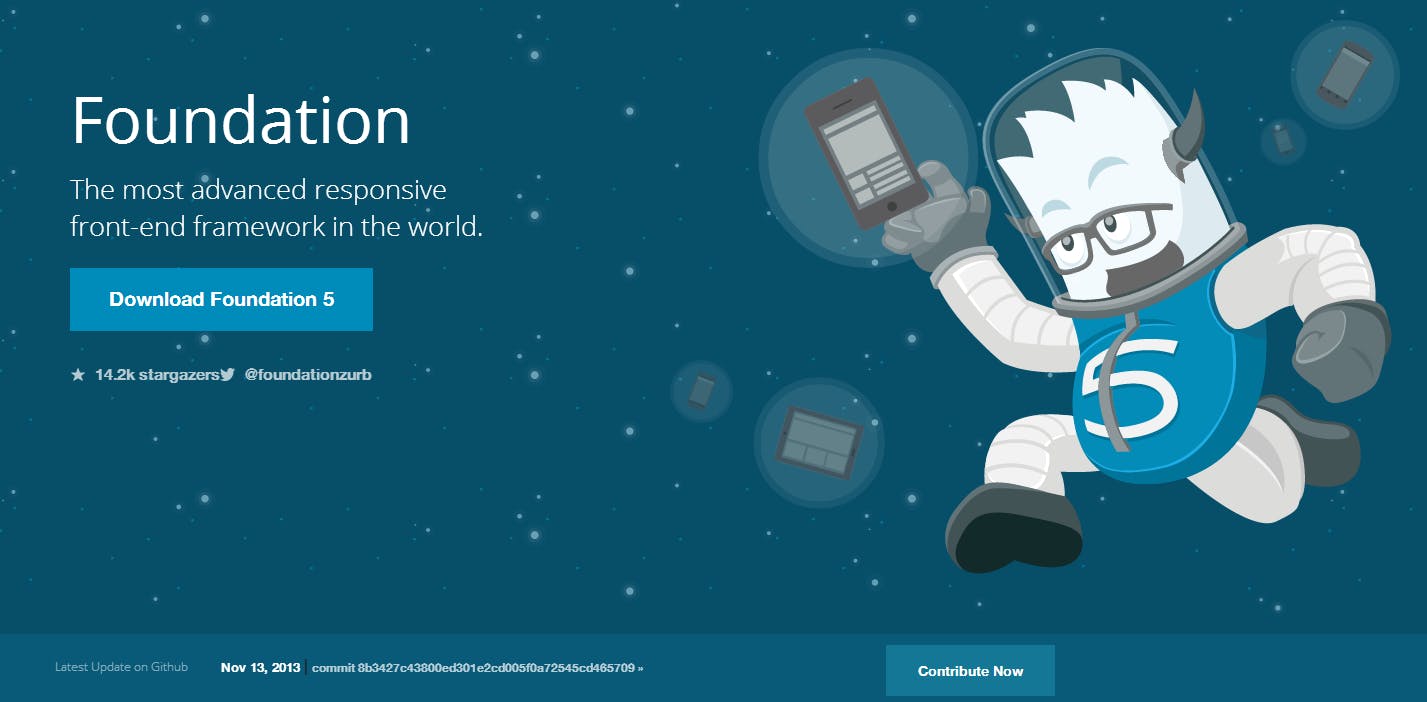
2.Foundation
This is a framework that allows others (and ourselves) build better designed future-friendly sites. Being the fastest way to responsively prototype and build for any device is not enough. Foundation also has to make us better designers to thrive in the ever-evolving world of mobile devices. That’s why we strive to make every new version of Foundation more advanced so you can code smarter and faster.
Foundation had its secret origins in the ZURB style guide in 2008, which we used on every client project. Eventually, we decided we needed a framework that allowed us to prototype rapidly. We took our global CSS, jQuery plugins, common elements and best practices, and whipped them into what became Foundation, which we first released in 2011.
3.Gumby
Gumby 2 is built with the power of Sass. Sass is a powerful CSS preprocessor which allows us to develop Gumby itself with much more speed — and gives you new tools to quickly customize and build on top of the Gumby Framework.
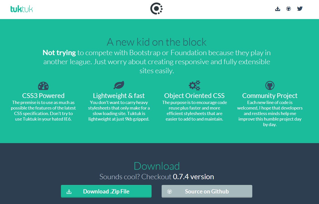
4.tuktuk
There are times when you may need to only show something on a desktop and not on a tablet or phone or the other way around. TukTuk will do all the work for you with some extra classes to hide & show content.
5.Centurion
Centurion is built on CSS3 and HTML5 semantics to allow you to start capitalizing on a next generation standard. If you’re worried about browser support we recommend the html5shiv or Modernizr to add the basic support for semantic coding.
6.Workless
Workless is a CSS base framework to get your projects up and running as quickly as possible.
7.Almost Flat
This sia framework builded based on foundation freamwork, very usefull and easy to setup
8.Yaml
YAML is continuously developed since 2005. It’s strongly focussed on device independence and accessibilty. It provides provides layout bullet-proof modules for flexible layouts.
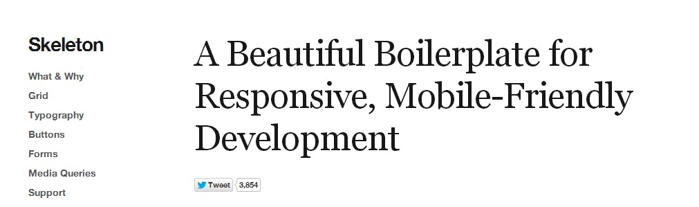
9.Skeleton
Skeleton is a small collection of CSS files that can help you rapidly develop sites that look beautiful at any size, be it a 17″ laptop screen or an iPhone. Skeleton is built on three core principles:
10.Wirefy
This is a beautiful framework for Responsive Wireframe Development focus make easier users intarfaces.

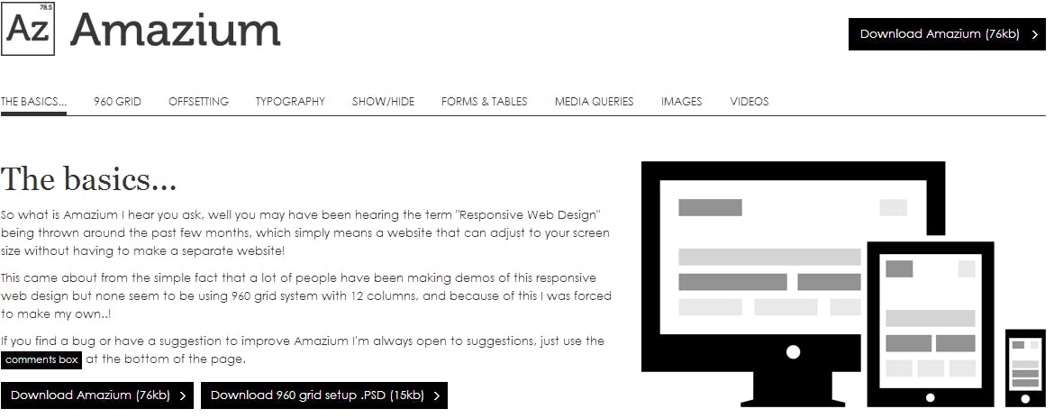
11.Amazium
So what is Amazium I hear you ask, well you may have been hearing the term “Responsive Web Design” being thrown around the past few months, which simply means a website that can adjust to your screen size without having to make a separate website!
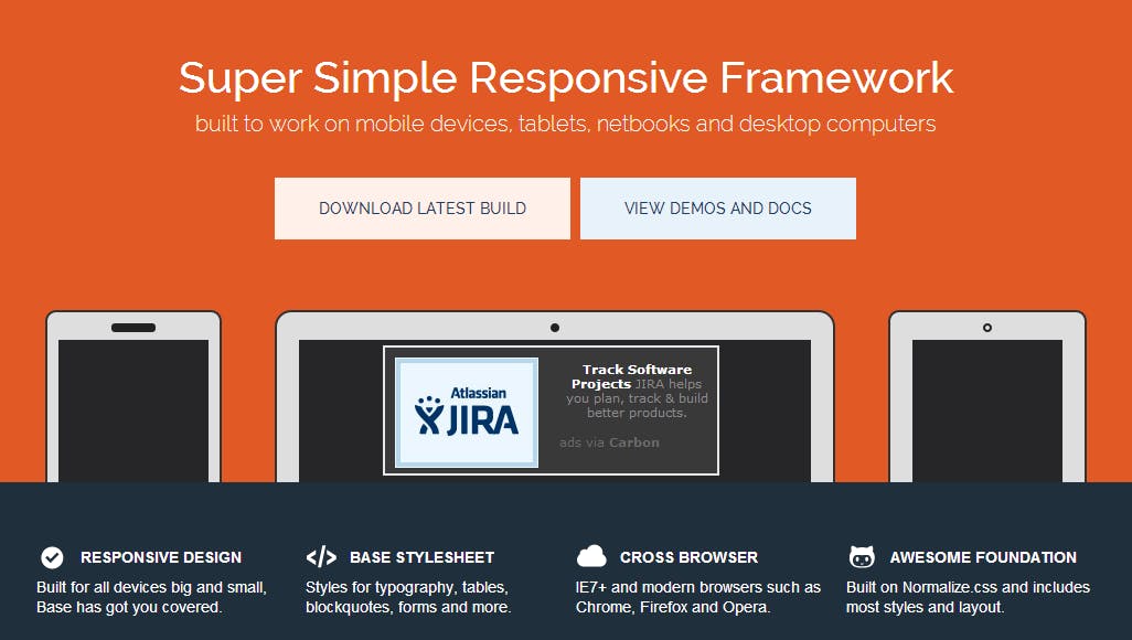
12.Base
A super simple, responsive framework built to work on mobile devices, tablets, netbooks and desktop computers. Base is developed in LESS, a powerful CSS pre-processor that helps you write cleaner, more organized, well structured CSS that you can easily maintain over time. Base supports all major browsers and legacy browsers such as IE7.
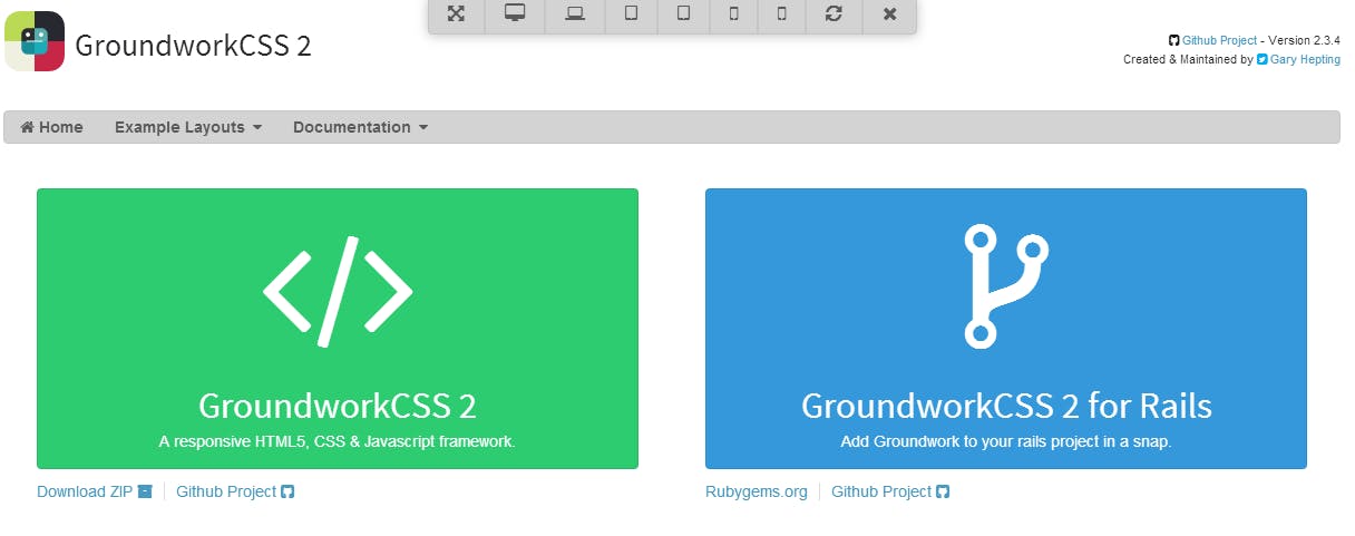
13.GroundworkCSS 2
A Responsive HTML5, CSS and Javascript Framework Create scalable, accessible web applications that work on virtually anything.


