Social media publishing tools have always made it easy for marketers to share the same message across multiple platforms. Just select your accounts, pick a few times, hit that all-powerful ‘publish’ button, and suddenly your message is everywhere.
But is that really the best social strategy?Different content works for different networks. A message that works well on Twitter likely isn’t what’s best for Facebook or LinkedIn. And as a consumer of content, I hate seeing the same message over and over.
Today, HubSpot is launching a brand new social media publishing tool. When they decide set out to design it they wanted to create something that would make it easier to do the right thing: publish unique content tailored specifically for each network. They also wanted your experience of the redesign to be entirely unremarkable — the best tools are so simple that it’s hard to imagine them working any other way. But getting to that point isn’t easy, which is why we’d like to show you how they designed, built, tested, and rebuilt something they hope will make marketers more effective.
Features Overview
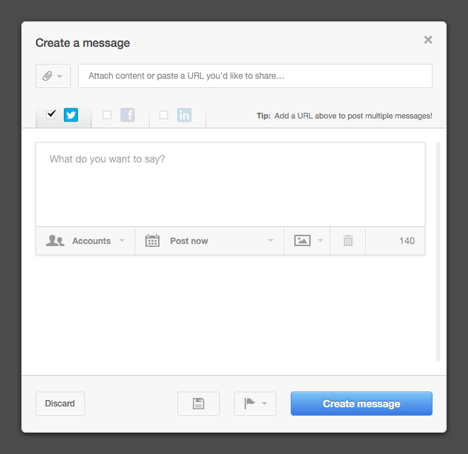
The old version wasn’t the best looking tool in the world, but it got the job done. Users could attach content within HubSpot, preview links used in their Facebook and LinkedIn messages, and publish to all of their different networks and accounts at once. People liked it, and they used it.
It also let people publish the same message to the same networks and accounts multiple times, which can be tedious for the people on the receiving end. It’s the social version of SPAM. Was that really the type of practice they wanted to enable?
Good inbound marketers know that different types of messages work better on different networks, and that repeating their social messages without variation over and over again leads to seriously diminishing returns. They realized that this new tool could actually be a force for good, by helping our users makes the web a better, more human place. They could do that simply by encouraging marketers to publish social content the right way.
Understanding Users Needs
Learning the routines and habits of those of you who are responsible for your company’s social media efforts — regardless of whether you use HubSpot or not — was an important first step. What was your day like? How was your workspace organized? What did and didn’t you have time for? They visited a few marketers to help answer these questions.
It was clear that, with marketers’ increasing responsibilities, most of you don’t have much time to devote to social marketing at all. The people they interviewed typically spent about 20 minutes every morning setting up their messages for the day, and then maybe they’d check in periodically to see what was working and respond to a few messages. The real challenge was in finding content that was worth sharing. And they needed to get more mileage out of the good content they had.
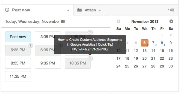
They also noticed that keeping track of what content to publish when is a big challenge for every social marketer. Coordinating multiple campaigns across multiple networks and accounts — and doing it effectively — was worth whatever effort it required. Here is how one HubSpot customer keeps track of his social media schedule:
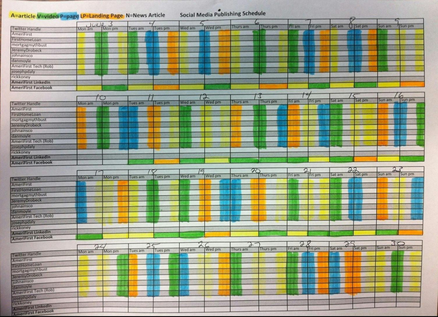
They saw many variations on this type of schedule, all requiring a considerable effort to maintain. This told us that knowing when different messages are scheduled to publish is a big deal for social marketers, and that even the simplest feature to help provide that view would save you valuable time.
Dashboard Renewal
Overview of the old Dashboard
Understanding how the new tool could help your business and solve real problems. Developers start to thinking in how to start on the interface of this tool, at the beginning v.1 of this tool it wasnt so great here a pict of how was it.
Looking back, it’s easy to see how much further they had to go. There’s no guidance, no obvious “start here!” component that draws the eyes, and no one was entirely sure what the different elements meant. But despite its (now) obvious deficiencies, it did get one thing right: It took what they learned from our research and put it all together in one place.
With all of the important features now focused in one design, they at least had something to work with. From here, they were able to prioritize features and remove anything that our users thought was superfluous. They had something to test our assumptions against.
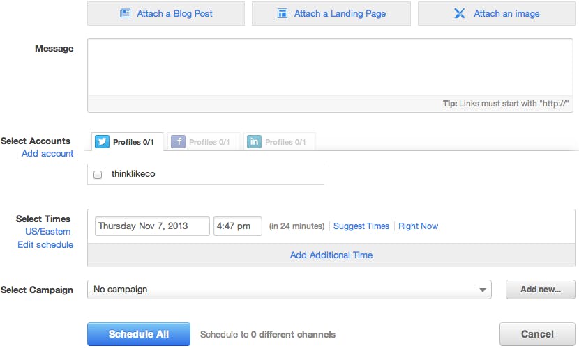
New Dashboard
At the initial testing process involved asking questions while users navigated through a series of clickable mockups that demonstrated a typical compose flow. This helped us discover what people found to be useful, what they didn’t understand, and how the new tool might fit into their daily routine. People loved that they would be able to write unique messages for different networks and that they could see what content was already scheduled, but few were able to notice those features without being told explicitly how to use them.
All of a sudden, it’s starting to look a little more focused and welcoming. It’s now clear which options are associated with your message and which are for the set of messages. They felt more comfortable with this design, so they started to build.
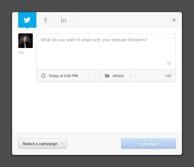
One feature that represented a big opportunity was the schedule drop-down. Knowing when to say something is just as important as knowing what to say. After drafting many different versions, they settled on a time-selection feature that tells users what’s already scheduled without getting in the way of the primary task of selecting a time to post.
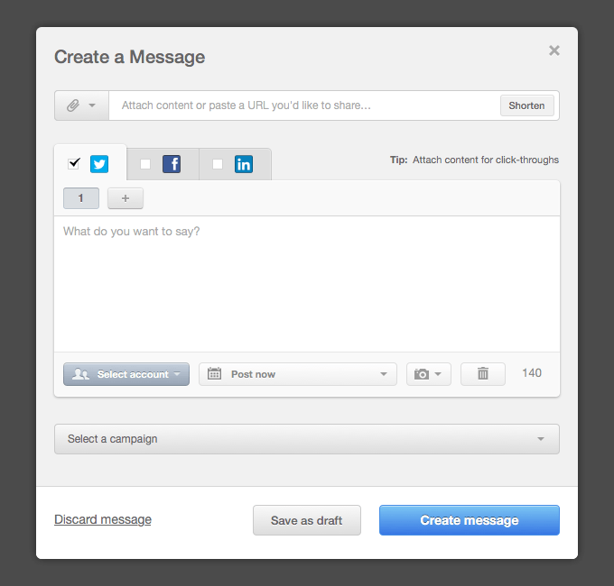
On their next round of testing was a little different. They spent less time asking questions and more time observing. Now that they had live code to test, we were able to see how users interacted with the tool as they went about their natural flow. This showed us how people used it in different ways, and how we needed to account for those differences.
For instance, we noticed people didn’t always select an account before trying to publish, and a few testers asked to be able to see which posts were already scheduled, missing the fact that this feature was already available to them. Based on this feedback, we worked to make those features more obvious, and this is what we ended up with:
Source : HubSpot